Tufte AI
Making data analysis intuitive for small businesses using AI
Overview
Interviewing for 8VC's Design Fellowship
During early February, I interviewed completed the design challenge for 8VC's 2025 Design Fellowship. While I was not selected, the experience of completing their challenge was deeply rewarding. It pushed me to expand my creative thinking and step beyond the entertainment-focused lens I had previously worked within. This opportunity challenged me to explore new problem spaces, refine my design process, and think more critically about how design can create impact across diverse industries.
The Prompt
Design a dashboard that lets users interact with and explore data using AI.
I was responsible for creating a data dashboard for Tufte AI, a startup that provides a data platform for businesses to gain insights from their information. The company is rolling out new AI capabilities allowing users to more easily engage with the data.
Product Preview
Tufte AI

Dashboard
- Key data important to you
- Auto-generated insights
- Monthly story-like reports
- Engagement activities
%20(1).gif)
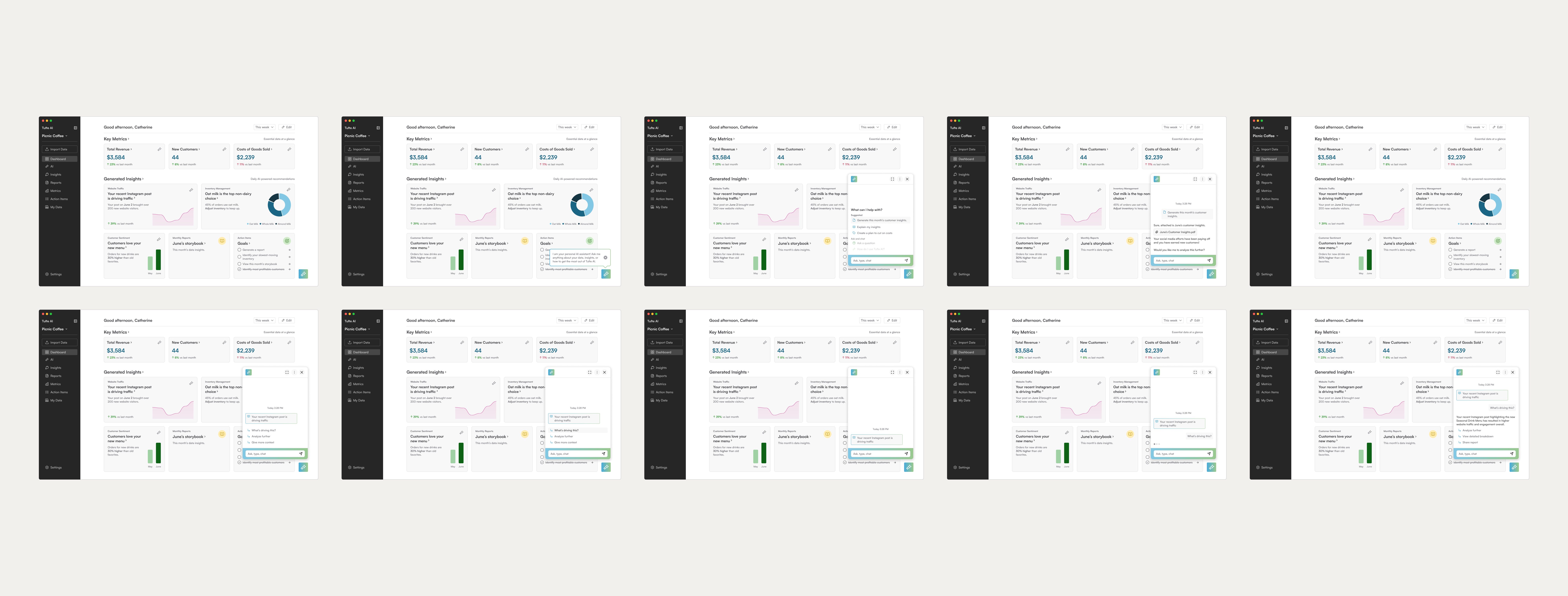
AI Chatbot
- Automated insights feed
- Personal chatbot
- Eliminate standalone hex values

Personalization
- Move around widgets
- Add or remove essential data
Discovery
Small businesses run the US
To define a clear user focus for Tufte AI, I conducted white paper research to narrow down our broad user base.
Key insights:
- 99.9% of U.S. businesses are small businesses → highlights their significance and potential impact.
- Main barrier: Lack of accessible knowledge prevents them from adopting digital tools.
This became a key focus area in the design strategy, highlighting clarity, accessibility, and support for small business users.
99.9% of businesses in the US are small businesses.
Source: US Census of Small Businesses
Barriers to entry for adopting digital tools
Lack of knowledge
Time-consuming
Difficult to use
Sources: 2023 US Chamber of Commerce Report; 2025 Intuit QuickBooks Small Business Index Annual Report
Considering these challenges, I asked:
How Might We
Make data informative, quick, and easy for small businesses?
Users want simplicity
Since I wasn’t deeply familiar with data platforms before this challenge, I began with a competitive analysis to explore the current market and learned:
- Users want simple, easy-to-use tools
- Users value personalization and the ability to configure layouts
- Intuitive UI is a must—but often missing in current platforms
Despite their power, many existing platforms:
- Have steep learning curves
- Feel overwhelming or cluttered
- Lack the personal touch users are looking for
These insights became core pillars in shaping Tufte AI’s user experience.

Synthesis & Exploration
Affinity mapping
To organize my research, I created cards and conducted an affinity mapping exercise. This helped surface 6 main theme groups, focused on:
- Personalization
- Feature variety and flexibility
These themes gave me a clear starting point for ideation and helped shape the direction of my design decisions.

Key features to include and improve
Based on my research, I defined key design goals to help close the knowledge gap and make the dashboard more approachable for users.
Personalization
Let users take control over what’s for them
Intuitive
Make it easy for any user skill levels
Informative
Simple, but still has the right information
Creating a user flow
Before designing the dashboard, I mapped out the full user journey to understand the Tufte AI experience.
During onboarding, users:
- Share basic info (like business type and data skills)
- Set goals for their data use
- Get tailored metric suggestions
After connecting their data, they’re taken to a personalized dashboard built around their needs. From there, I designed the key features to support their goals.

Iterations
Sketching out the vision
I sketched out a dashboard for users who aren’t entirely comfortable with data analysis, prioritizing:
- A quick and simple layout
- Room for exploration
- Key information

After gathering feedback from designers and refining my understanding of the Figma API, I streamlined my wireframes to ensure feasibility and went through a few major improvements.
Dashboard
Breaking it down
Building on my initial sketches, I used Figma to create a clearer visual hierarchy and incorporated additional features—each grounded in user needs and the broader experience strategy.

Creating a balanced dashboard
I narrowed my dashboard designs down to two layout options:
Option A: Equal Balance
- Balanced layout between user-created metrics and AI-generated insights
- Right-side panel includes engaging, exploratory features
- Concern: AI doesn’t feel prominent enough, and side panel lacks clear organization
Option B: AI-focused
- Large, dedicated space for AI insights
- Concern: Weak visual hierarchy—could feel overwhelming or confusing at first glance
I went with a refined version of option A and focused on improving clarity and structure while keeping the layout balanced and approachable.

AI Chat Display
Offering familiarity to users
I went with a chat-based AI experience because it felt the most intuitive and user-friendly.
Option A: Chatbot
- Familiar interaction style for most users
- Allows users to view other dashboard elements while chatting
- Feels lightweight and integrated
Option B: Side Panel
- Occupies about 1/3 of the screen
- Felt bulky and visually heavy
- Repetitive, since the platform already has a dedicated AI page

Quick access to the chatbot
After receiving feedback from my interviewer, I identified a key usability gap: If a user had a question about a specific insight, there was no quick way to activate the AI.
I added a chatbot icon to the top right corner of each insight card.
- One-click access to AI, right where the question arises
- Tooltip included to guide users on its purpose
- Keeps the experience smooth and context-aware

Design Decisions
Final Product
Tufte AI
Dashboard
- Key data important to you
- Auto-generated insights
- Monthly story-like reports
- Engagement activities
AI Chatbot
- Automated insights feed
- Personal chatbot
- Eliminate standalone hex values
Reflections
Takeaways
1. Less is more. When handling lots of data, I found myself overthinking how many accent colors needed to be used. After lots of trial and error, I realized that a more subtle approach is best to let the data stand out for itself.
2. Prioritize business functions. I worked through finding a clear balance between the issue at hand and adding additional features. For the sake of time, I needed to understand which features I wanted to focus on for the challenge and work within a tight timeframe.


